TO MEET · 05/07/2013
Behind 121 Greene: Partners & Spade
You’ve seen our new flagship store on Greene Street—we hope!—and even if you can’t make it in person, we’ll be sharing some behind-the-scenes intel.
First up, we rang up Partners & Spade, our beloved crew of innovative thinkers, rogue brainstormers, and creative, well, partners who helped conceive the library-inspired space.
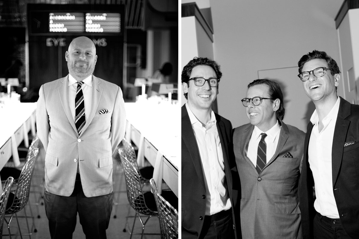
Pictured above: left, Anthony Sperduti of Partners & Spade; right, Andy Spade (center) with Warby Parker co-founders Neil Blumenthal and Dave Gilboa.
What can you tell us about the store’s design?
To us, Warby Parker means the literary life well lived. Intelligence, sophistication, and style— these are all qualities that make complete sense for an eyewear brand to embody. While setting up all the temporary stores, Neil and I realized that there’s a very social element to trying on glasses. With most optical shops, you have to ask someone to try on glasses. The glasses are behind glass or in a case that has to be unlocked. That’s no fun. People want to model frames for their friends and socialize as they shop. We wanted to create a flagship store that reflects that, a store that goes above and beyond expectations.
What were your aesthetic inspirations?
We were inspired by the architecture of great libraries.The quick and easy referencing and browsing that happens at a library mimics the way we wanted people to shop for glasses.

How did you achieve this?
The floors are terrazzo, a material usually used in federal buildings and airports. It’s a highly-finished, highly-polished material that gives a sense of sophistication, permanence, and grandeur. We made floor-to ceiling shelves using rosewood, which was prevalent in mid-century furniture design. We did a bunch of research on classic library lamps, and had a small fleet of them custom-made from brass. Our rolling ladders come courtesy of Putnam Ladder Company, a downtown NYC company that’s been around for a hundred years. They’re the iconic rolling ladder company. The ladders are custom, with brass poles that stretch the entire length of the store. All of these choices were made to telegraph permanence.

Are there any architectural features that were chosen with particular purpose?
There are mirrors between every bay of glasses, plant boxes, a huge skylight, and a Photo Booth with collaged backdrops created by Alia Penner. The store encourages curiosity, but it’s also just a pleasant place to spend time.
What can you tell us about the exam room?
We wanted to make it the centerpiece—something that people noticed rather than something tucked away in the back. We wanted customers to easily be able to see the time of their appointment. We thought about the by the train arrival and departure boards at Grand Central Station, and worked with programmers and animators to create something similar.

Photography by Kevin Tachman (top), Collin Hughes (all others).


